SETLISTS AND SHOW RATINGS
[we'd like to thank Paul Jakus, @paulj, for his second deep dive into the statistice of Phish. - ed.]
Phish fans are famously obsessive about the band, and the setlists on .net reflect that obsession. Setlists on Phish.net are not simply a list of songs played; instead we are provided with a wealth of information about debuts, bustouts, narrations, and even notation denoting two types of segues. All of this information tries to characterize what happened at a concert (far more than just listing a bunch of songs) with the goal of pointing us to shows of particular interest.
But does this additional information have value? Does knowing the number of “->” segues, or that a song hasn’t been played in over 100 shows, truly correlate with how fans of the band perceive the quality of a given show? Can we look at an intriguing setlist from 10 or 15 years ago (or look at today’s setlists a decade from now) and use its content to determine whether or not to listen to the show? That is, do the elements of a Phish setlist relate to how we, the members of Phish.net, rate Phish shows?
Phish.net show ratings are somewhat problematic from a statistical standpoint, but let’s put that aside and simply say that show ratings, for good or bad, reflect only the opinions of .netters. (See the third paragraph of this blogpost for problems regarding .net show ratings.)
https://phish.net/blog/1531526830/the-time-goes-past.html
I gathered a bunch of setlist data for 359 3.0 era shows, from the Hampton Reunion run through the 2017/2018 NYE run, and estimated a regression model linking setlist notes to show ratings. PM me if you want the detailed model, but let’s just highlight the things that were statistically related to the show rating on Phish.net:
Setlist Elements and Show Ratings
|
Setlist Notes Related to Show Rating |
Setlist Notes Not Related to Show Rating |
|
Number of Songs per Set (−) |
Debut songs |
|
Number of “>” segues (+) |
Vacuum solos |
|
Number of “->” segues (+) |
Guest artists |
|
Average song gap (+) |
|
|
Narration songs (+) |
|
|
Festival Shows (+) |
|
|
Three set shows (+) |
|
|
Shows on a Weekend (+) |
|
|
Time Trend (+) |
|
The “±” sign in parentheses is the direction of the effect on the show’s rating. For example, the more songs that are played the less we like it (negative) and the more “->” segues that are played the more we like it (positive).
Here’s a graph that uses the statistical model to depict the actual show rating on the vertical axis and the predicted show rating (“fitted value”) on the horizontal axis. A perfect model would have its predicted value exactly equal to actual value, so that every dot would lie along the dashed line. Of course, the model was not perfect (it explained just under 40% of the variation in show rating) but you can see that, broadly speaking, the model predicts a high show rating when a show actually was rated highly, and vice versa.
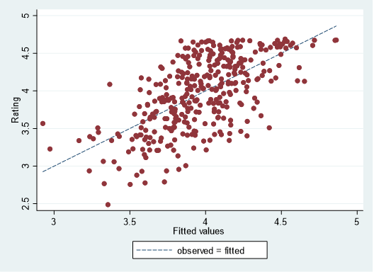
Now you might think that explaining only about 40% of variation in show rating is not very good but I was pleasantly surprised: I didn’t think it would explain much more than 25% or so. The setlist information does a decent job of identifying the characteristics of a good Phish show.
But can a statistical model based on 2009-2017 data predict how .netters would rate shows in 2018? Let’s take a look at our actual ratings for the Summer 2018 tour, and compare them to what the statistical model would predict, given the 2018 setlists:
Actual .net Ratings versus Model Predictions
|
Show |
Actual .net Rating |
Model Prediction |
|
Tahoe N1 |
3.766 |
4.031 |
|
Tahoe N2 |
3.397 |
3.782 |
|
Gorge N1 |
4.141 |
4.275 |
|
Gorge N2 |
3.644 |
4.200 |
|
Gorge N3 |
4.592 |
4.413 |
|
BGCA N1 |
4.393 |
4.055 |
|
BGCA N2 |
3.711 |
3.956 |
|
Forum N1 |
4.286 |
4.287 |
|
Forum N2 |
3.803 |
4.201 |
|
Del Valle |
3.453 |
3.963 |
|
Alpharetta N1 |
4.596 |
4.261 |
|
Alpharetta N2 |
4.273 |
4.161 |
|
Alpharetta N3 |
4.413 |
4.351 |
|
Camden N1 |
3.624 |
4.016 |
|
Camden N2 |
3.871 |
3.997 |
|
Raleigh |
4.259 |
4.328 |
|
MPP N1 |
3.490 |
4.344 |
|
MPP N2 |
4.608 |
4.322 |
|
Dick’s N1 |
4.618 |
4.351 |
|
Dick’s N2 |
4.053 |
4.178 |
|
Dick’s N3 |
4.282 |
4.361 |
As it turns out the model didn’t perform all that badly. Out of 21 shows from Summer 2018, the model predicted 15 to within 10% of its actual value. Sometimes a graph is better than raw data, so here’s the absolute percentage of prediction error plotted against the actual show rating:
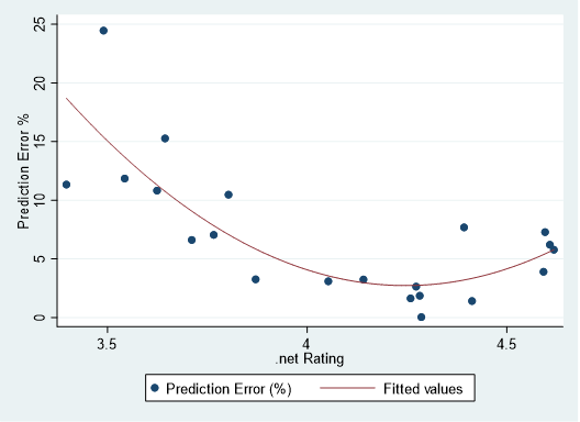
As you can see, the model predicts pretty darn well for shows that have a show rating of about 3.8 or higher, but that the errors get large with the lowest rated shows. One show, MPP N1 (at the top left of the graph), is off by a whopping 25%.
In fact, MPP N1 caught my attention the day after it was played: I had missed the webcast and logged onto .net the next morning to check out the setlist, which looked fantastic. An eight-song first set with "Blaze On," "Stash," and "46 Days"? A five-song second set filled with heavy-hitters?! A four song encore!?! This must have been an incredible show, right?
Umm, no, apparently not (we rate that show as a 3.49).
So, though the setlists satisfy their primary job of pointing us to good shows, MPP N1 helps highlight the shortcomings of any statistical model. The model can only measure what’s on paper, and can’t really measure the magic of an improvisational performance. We can analyze setlists all we want, but we still gotta to listen to the show.
Comments
You must be logged in to post a comment.
 The Mockingbird Foundation
I'm actually rather pleased that the model works to some degree (setlists do convey good information) but that they don't capture everything.
Set 2 was good, the Sand was average but nice. Mercury ghost the highlight. Also loved the Martian monster version.
Set 1 though... Yikes.
Looking at the model output, you can tell what the ideal 3.0 show looks like on paper:
--three sets, with only a few songs per set
--lots of segues
--major bustouts
--narration songs
--played on a weekend at a festival
...sounds like a good time to me!
Also the time trend indicates that either recent shows have biased ratings, or the band is improving over the course of 3.0. Probably both are true.
Oh, the # of raters would be lower the more recent the show...and show ratings also fall over time. So those add more complications.
If you love rarities or throwbacks, MPP n1 is not the show for you but KyleIndeed's review of it captured how solid a large part of that show actually was, worthy of the model projection. Neat study.